| |
Music notation
|
I have made modifications to the traditional music notation systems,
with the intention to make the music easier to read or write.
|
|
Sheet music
|
|
Octaval stave
|
read more
|
|
Exaggerated features indicating length of notes
|
read more
|
|
Diacritical marks for sharp and flat notes
|
read more
|
|
Reduction of unnecessary duplicate information
|
read more
|
|
Row change markings
|
read more
|
|
Graphic symbols for tempo changes
|
read more
|
|
Textual notation
|
|
Three octaves marked with C-B, 1-7, c-b
|
read more
|
|
Note lengths
|
read more
|
|
Sharp, flat and neutral notes
|
read more
|
|
Chord symbols
|
read more
|
|
Rhythmic subdivision of measures
|
read more
|
|
Examples
|
read more
|
|
Sheet music
|
|
|
|
Octaval stave
|
|
The piano keyboard is divided into visually similar octaves. If you know where the C is in one octave,
you can easily find the C also in any other octave.

I use an octaval stave in sheet music, which consists of the three lowest lines of the traditional treble stave.
This notation is understandable without explanations for anyone who can read traditional sheet music,
as long as the melody stays within this primary octave (C4 ... B4).
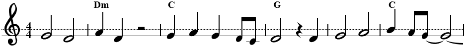
The reader may wonder where the two highest stave lines have disappeared, or why the G line is dotted rather than solid.
But these thoughts will not prevent the reader from understanding the notation.
The differences, and advantages, of octaval stave become apparent when the melody goes outside of the primary octave.
Below is a melody that covers four octaves, shown first with traditional stave and then with octaval stave.

Traditional notation becomes rather cryptic in the lower and higher octaves – indeed so cryptic that majority of humans
would simply stop playing, and start painstakingly counting the number of short dashes under each note.
But octaval stave maintains the same ease of reading as in the primary octave, no matter what the octave is:
- C notes are the ones with a short additional dash over them.
- G notes are the ones on a dotted G line.
- F notes are the ones in a gap under a G line.
- B notes are the ones on the line which is over the G line.
And so on. Easy and fun – as music should be!
Note that we usually add a full set of three stave lines, if a note is outside of the main octave (of the three main stave lines).
In traditional notation, notes outside of the main stave lines are recognized by
“counting the short dashes”, and then making some rather complex conclusions about that.
In octaval stave we want notes to be recognized in every octave as easily as in the primary octave.
For this reason we prefer to always draw full sets of three stave lines, and not only additional short dashes
outside of the main octave, to provide a familiar context in which the notes are easy to recognize.
|
|
Exaggerated features indicating length of notes
|
|
All graphic note symbols on this page are modified versions of the traditional note symbols.
I prefer to exaggerate the visual characteristics which indicate the length of a note.
Let us compare side by side the traditional note symbols with the ones that I use on this page:
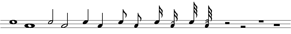
The notes on the upper row (which would be A notes) are traditional note symbols,
and the ones on the lower row (F notes) are modified versions, which I use on this page.
The quarter note and half rest are identical in both versions. All other of these notes or rests have
some exaggerated visual characteristics in my modified version:
The full rest, full note and half note are 30% wider than the traditional symbol.
All notes shorter than 1/4 note are 30% narrower than the traditional symbol.
Notes shorter than 1/8 note have one or more additional curved lines near the notehead,
on the same side of stem where the notehead is. (A bit counter-intuitively, the number of these lines
is one less than the number of flags in the stem.) The purpose of these lines is to bring complete
information about note length closer to the notehead, so that staring at the notehead with a narrow
attention span is enough to tell the length of the note, without a need to look at the upper end of
the stem, where the flags or beams are.
I generally avoid writing notes shorter than 1/8, however. If my melody contains 1/16 notes or 1/32 notes,
I always give some thought to the question, would the sheet music be easier to read if I multiply the note lengths
by 2 or 4, and then use a 2 or 4 times faster tempo marking. Sometimes the answer to this question is yes,
sometimes it is no. If I use doubled note lengths, I write the tempo as 2*100 instead of 200,
to give a hint that the tempo and note lengths have been multiplied by two.
|
|
Diacritical marks for sharp and flat notes
|
|
The notation example below demonstrates the use of “diacritical marks”, small hooks at the front edge of notehead,
to remind the reader that note E is flat in this key signature.
Here is the full list of such “diacritical marks” for various circumstances,
together with some modified flat and sharp symbols. Only two of these cases are common in sheet music:
flat and sharp onto a black key. All other cases are relatively uncommon.

|
|
Reduction of unnecessary duplicate information
|
|
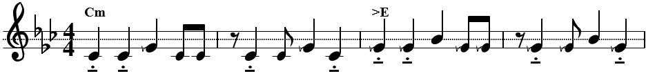
Sheet music tends to contain a lot of information noise, unnecessary duplicate information, which makes it difficult to
focus on the essential. Beethoven’s Moonlight Sonata is a prime example of this:

At first sight this sheet music may look a bit eccentric, but in fact it is much easier to read than
typical sheet music of this melody.
The octaval bass clef is introduced here for the first time in this article.
In traditional notation the bass clef has two points, which are on both sides of the stave line of note F.
In octaval stave the note F is always between stave lines, so the bass clef needs to be modified to indicate this
(and to alert the reader that this is not a regular bass stave).
In this sheet music I have clarified the information noise in each set of three 1/8 notes, by using 50 % grey colour
in the note-heads that are same as in the previous set of three 1/8 notes. When some note changes, it has black colour.
This helps the reader of notation to focus on the essential, what changes compared to earlier notes.
If all notes in the measure are same as in the previous measure, this has been indicated by using 50 % grey colour
also in the shafts and beams of notes. (A more widely known method for this purpose would be using simile symbols.
I believe that my style of notation stands comparison to simile symbols, both in ease of reading and in aesthetic beauty,
for which the simile symbols are not particularly famous.)
|
|
Row change markings
|
|
The optimized Moonlight Sonata sheet music above contains row change markings at the end of each notation row.
Normally a melody is easy to follow in sheet music, as each note is drawn after the previous note, and you can see how
much up or down the next note will be, compared to the previous one. But at the end of row we lose that
visual connection between the currently played note and the next one.
Row change markings provide that missing visual connection:
We draw an additional copy of the first note of next row at the end of the previous row.
(If the next row begins with a short rest, the note after the rest can be drawn with 50% grey colour in the
row change marking, to indicate that the note will not be played immediately at start of the next row.)
|
|
Graphic symbols for tempo changes
|
|
Tempo changes are usually indicated verbally in sheet music (e.g. “accelerate” or
“slow down”), while nearly everything else is indicated with graphic symbols.
This is practical enough in most cases, as tempo changes are usually quite rare, or in any case easily predictable in nature.
In rare cases a musical composition can use a fluctuating tempo, which the composer wants to define precisely,
but which is not easy to describe verbally, with satisfactory accuracy. The diagram below indicates the tempo of the first
87 measures in our next melody example. The tempo undergoes some changes after every 1/4 hit, so that two consecutive
1/4 notes are never played with the same tempo.

The 21 white blocks under this tempo diagram indicate sets of 4 measures. The composition uses phrased
fluctuating tempo, where each set of 4 measures starts with exaggerated acceleration, and then gradually
slows down towards the end of phrase. (The melodic phrases are 8 measures long in this composition, though,
so each melodic phrase contains two cycles of phrased fluctuating tempo.)
In addition to this major trend in the tempo, each measure (which contains three 1/4 notes) undergoes similar
phrased tempo fluctuation in miniature size: the first (bassline) note has fastest tempo, and the second note
has a slower tempo, and the third note in measure has the slowest tempo.
When the tempo fluctuation is as complex as this, a graphic presentation of the tempo might be useful in sheet music.
The standardized notation symbols don’t include graphic symbols for tempo changes, so I designed my own symbols:
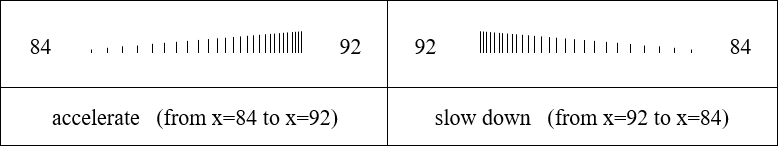
Now we test these symbols in the sheet music of the melody example with a complex tempo fluctuation.
(Actually we use the “slow down” sign only, because acceleration is always rapid in this
tempo fluctuation, and slowing down is gradual.)

We have two tempo indicators here, which give the same information, so only one of them would be needed in sheet music.
The saw-edged version shows a precise tempo recommendation for every 1/4 note. The version with vertical lines is a bit more
vague to read, but more compatible with the aesthetic traditions of sheet music.
Why would anyone use such a complex tempo? You can listen to a melody excerpt of 40 measures from the links below,
and decide for yourself, which version is more pleasing to hear: the one with phrased fluctuating tempo, or the one
with a steady tempo.
|
|
Examples
|
|
On the Music page you will
find several complete songs as octaval notation. An example with the most advanced features is the sheet music of
piano melody Attentiveness (which contains the first
page only, though).
|
|
Textual notation
|
|
MIDI music programs are the easiest way to compose music and share the results with other people.
Just create notes with a few mouse clicks, listen how it sounds, and then save the work on your computer.
However, the inspiration to compose music can sometimes hit in circumstances where such programs are not at hand.
Majority of all music that I have ever composed, was first sketched in circumstances where no computer was at hand.
Sometimes no instruments either, just pen and paper. My typical music composition begins by sketching a melody line and chords
on a small A6 size pocket notebook (10 x 15 cm / 4 x 6 inches).
Or on a random piece of paper, which I urgently find in the nearest trashbin.
My preference for a small notebook paper size is so deep in the backspine that I fold the paper into size A6,
if I have a larger paper at hand when writing down a melody sketch.
As an authentic example of this process, below is a photo of my handwritten manuscript from year 1999
(which shows the top part of an A6 size notebook page), and a later reconstruction with computer Notepad (transposed 5
semitones higher), and the final sheet music:
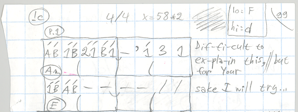
lo: >B   I)  Dm                                                 A
hi: g    (   ,   ,   ,  ,    ,  ,  ,  ,  )       ,           )  ,   ,  ,   ,       )
x = 100  (   2   3   4  3    5  4  3  4__)__-  ' 4   6   4   )  4   3  2   3___--__)
>B  4/4  :                 (             :         (         :               (     :
         :  Dif-fi-cult to  ex-pla-in this,     but for your   sake I will try...  :
IVccBV   ___________________________________________________________________________

If a melody and chords are all what you need to write, textual notation has some advantages compared to graphic sheet music.
It is faster to write, more music fits on a small paper, and the risk of later mis-interpreting the pitch of handwritten notes
is smaller, when the notes are alphanumeric characters, rather than small dark balls quickly scribbled on or between stave lines.
|
|
Three octaves marked with C-B, 1-7, c-b
|
|
Textual notation systems have existed for thousands of years. The most widely used ancient letter notations mark notes
of the octave with letters C D E F G A B, while the more recent numbered notations (developed in the 1700’s) mark the
notes of an octave with numbers 1 2 3 4 5 6 7. If the melody does not fit within an octave, additional symbols are necessary
to indicate octave of the note.
I use a combination of these historical systems, to cover three octaves without need for additional symbols to
indicate octave of the note. I use numbered notation 1 2 3 4 5 6 7 for the primary melody octave (where 1 means C4),
and uppercase letter notation C D E F G A B for the octave below this (where C means C3), and lowercase letter notation
c d e f g a b for the octave above these (where c means C5).
If the melody or bassline goes outside of these three octaves, I use additional characters U
(“3 octaves up”) or L (“3 octaves lower”) to handle three more octaves above and below the
three middle octaves:
                  U   c  d  e  f  g  a  b      = C8 ... B8
                  U   1  2  3  4  5  6  7      = C7 ... B7
                  U   C  D  E  F  G  A  B      = C6 ... B6
                  {   c  d  e  f  g  a  b   }  = C5 ... B5
3 MIDDLE OCTAVES: {   1  2  3  4  5  6  7   }  = C4 ... B4
                  {   C  D  E  F  G  A  B   }  = C3 ... B3
                  L   c  d  e  f  g  a  b      = C2 ... B2
                  L   1  2  3  4  5  6  7      = C1 ... B1
                  L   C  D  E  F  G  A  B      = C0 ... B0
A low bassline note sequence could be notated as “L c g c e”, where L tells that the following notes in
character set c d e f g a b are three octaves lower than the same symbol in primary octaves – until N
(for “normal”) would tell that the following notes belong to the primary octaves. (These signs L,
U and N affect one character set only, and not all character sets, so we don’t need to constantly change between
L and N signs, when a bassline roams between octaves L c d e f g a b and N C D E F G A B, for example.)
In real life I often omit the L and N characters, and simply use the character set c d e f g a b, when the bassline goes below
the three middle octaves. It is obvious from the context that the bassline will not jump from C3 to B5, but rather to B2.
In handwritten notation you may need to avoid confusion between uppercase C and lowercase c.
You can write the lowercase c in exaggeratedly small size, or with a script font, or with a vertical slash
(as in the cent symbol ¢).
|
|
Note lengths
|
|
My preferences for marking the note length in textual notation differ from the traditional systems,
and will not be understood ex tempore by a person who has never seen my textual notation before:
      Length        Note               Rest

      2/1           C---_----          ////_////

      1/1           C---               ////

      3/4           C--                ///

      1/2           C-                 //

      1/4           C                  /
                    ,
      1/8           C                  '
                    v
      1/16          C                  "
                    w
      1/32          C                  ^
                              ,
      3/8           C.   OR   C-       /'    OR   '/
                              ,
      5/8           C-.  OR   C--      //'   OR   '//
                    ,         v
      3/16          C,   OR   C.       '"    OR   "'
                    v         w
      3/32          C;   OR   C,       "^    OR   ^"
Some of these notes consist of two characters on top of each other, on two rows. For example, 1/8 C note
consists of a comma (,) on top of letter C. In computer Notepad use a monospace font, such as Courier,
so you can align characters on top of each other.
A remarkable deviation from common notational practices is that the symbols which
affect the length of note (- . , ;) have a constant length value.
For example, the dot (.) always has length value 1/8 – while
in traditional systems the dot adds 50% to the length of the preceding notational symbol,
and can thus have also other length values than 1/8.
If you look at the 5/8 note in the chart above, C-. consists of a half note C- and a dot.
But the dot does not add 50% to length of the half note: it adds only 1/8 to the length.
|
|
Sharp, flat and neutral notes
|
|
I prefer to use symbols which are easy to produce with a standard computer keyboard:
Sharp = # Flat = > Neutral = !
|
|
Chord symbols
|
|
I write the sharp or flat sign at start of the chord symbol, and to use the above-mentioned sharp and flat signs
in chord symbols – also in sheet music, not only in textual notation:
#C >Bm7 A #Fm >E
|
|
Rhythmic subdivision of measures
|
|
Sometimes I write a left parenthesis at middle of each 4/4 or 6/8 measure
(one row lower than the melody line), to visually split the measure into two halves.
This makes it easier to read the rhythm of the music, especially in time 6/8.
In that time signature I also tend to write the notes as twice longer than they are in reality
(C- is not 1/2, but rather 1/4), which is indicated with the sign Q2 (“notes are twice quicker”),
to make the rhythm maximally easy to read.
             >B             F              Gm             Dm
>   6  Q  (              )              )              )              )
BE  8  2  (  d--   c- 7  )  c--   f- 6  )  7--   6- 5  )  6--   d- c  )
          :      (       :      (       :      (       :      (       :
|
|
Examples
|
|
On the Music page you will
find several complete songs as textual notation. These examples give you a broader perception of the notational
style that I consider to be clearest to read, and also many useful details that are not mentioned in this short presentation.
|
|
|